Rather than going right to the end, you might like to read this to get your/our juices flowing. Not that kind of juice. The creative kind.
Logo Design Theory: Symbols, Metaphors And The Power Of Intuition
www smashingmagazine.com/2015/06/effective-logo-design-symbols-metaphors-intuition/
Damn, you can't post any links here
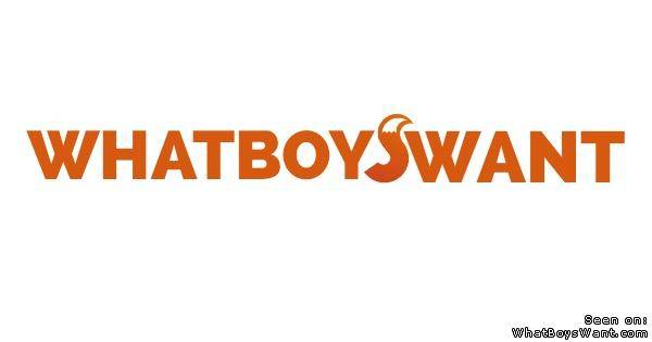
There used to be a logo. There was a whole contest and everything, if I recall, and they ended up picking an orange cartoon beaver. Like, the animal not the body part.
omeko finds this awesome.
I personally liked the beaver. It was nicely drawn and made sense. Not saying the fox wouldnt, i just dont know if people will see the fox and put 2 and 2 together if that makes sense. I could be over thinking it though
it would be cool if we could get t-shirts with the wbw logo
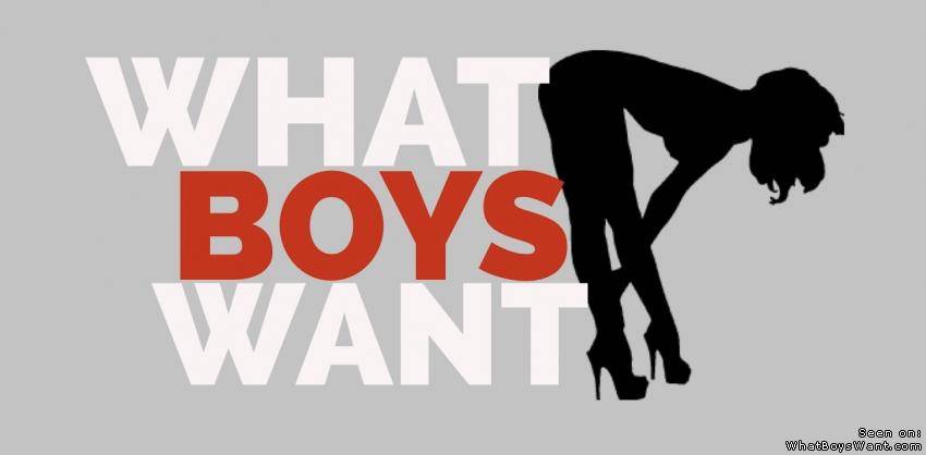
What do boys want? A pair of big round and firm tits. So the logo should
show just that and a smiling mouth under it. How about that?
A silhouette of a chick leaning on or over the hood of a car.
Somehow my mind always go back to this I used in the beginning.
Click to view :P
Would be good to have a woman in that logo or anything along the lines of showing some lady-curves.
I had suggested WBW many times to close friends and other places and they thought it was "boy meets boy" gay thing XD!